DNA-LEVEL" STATISTICAL PROOF: "Smartmatic" Vote-Counting System Was Manipulated in PA and GA to Overturn Trump's Victory
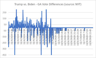
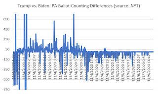
The charts below are derived from The New York Times' real-time election feeds (e.g., here). They show "DNA-level" evidence of vote fraud that was systematically used to overcome massive Trump leads with "vote flips" to Biden.
The twin charts below depict the shifts in votes starting on election day. The X-axis is the date/time and the Y-axis represents the change in votes (positive values denote shifts for Trump, negative values represent shifts for Biden, in hundreds).
Notice the similarities in PA and GA? How the right sides of the graph show virtually no movement for Trump; and very predictable vote movements to Biden. How predictable?
You have to see the data to really understand the magnitude of the scam.
Below are excerpts of spreadsheets that show what was happening on the right side of each chart. Vote flips in the same-sized bundles (6,000 in PA and 4,800 in GA) were injected into the system to overcome Trump's lead in both states. You can click either image above to see all of the data.
The highlighted cells show where the vote counts -- stunningly obvious in retrospect -- were manipulated to benefit Biden.
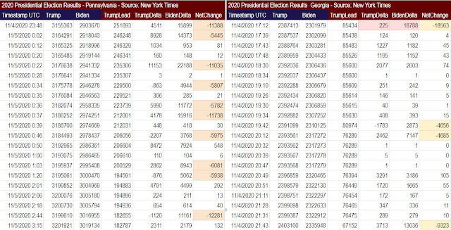
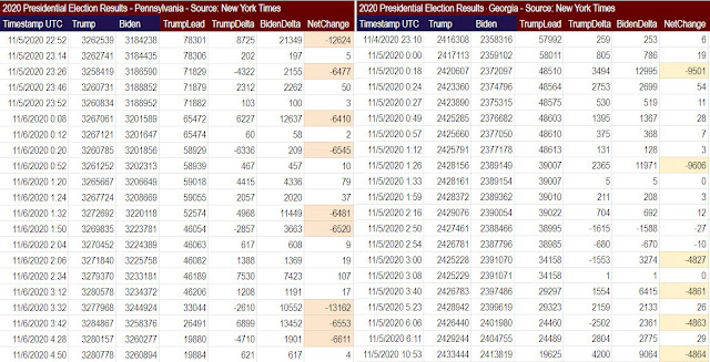
Note the vote flips, represented by the highlighted cells, that occurred in both PA and GA. In PA, late vote flips in bundles of around 6,000 were clear anomalies to slowly overcome Trump's lead. In GA, the bundles were in 4,800 vote swaps.
Again, these are just excerpts. You can see the workbooks for yourself here: just click for Pennsylvania and Georgia.
Scroll down until you start hitting the highlighted cells.
Sorry, Democrats: this is what we call DNA-level statistical proof of fraud.
And there's a lot more where this came from. These are just the excerpts.
The charts below are derived from The New York Times' real-time election feeds (e.g., here). They show "DNA-level" evidence of vote fraud that was systematically used to overcome massive Trump leads with "vote flips" to Biden.
The twin charts below depict the shifts in votes starting on election day. The X-axis is the date/time and the Y-axis represents the change in votes (positive values denote shifts for Trump, negative values represent shifts for Biden, in hundreds).
Notice the similarities in PA and GA? How the right sides of the graph show virtually no movement for Trump; and very predictable vote movements to Biden. How predictable?


You have to see the data to really understand the magnitude of the scam.
Below are excerpts of spreadsheets that show what was happening on the right side of each chart. Vote flips in the same-sized bundles (6,000 in PA and 4,800 in GA) were injected into the system to overcome Trump's lead in both states. You can click either image above to see all of the data.
The highlighted cells show where the vote counts -- stunningly obvious in retrospect -- were manipulated to benefit Biden.


Note the vote flips, represented by the highlighted cells, that occurred in both PA and GA. In PA, late vote flips in bundles of around 6,000 were clear anomalies to slowly overcome Trump's lead. In GA, the bundles were in 4,800 vote swaps.
Again, these are just excerpts. You can see the workbooks for yourself here: just click for Pennsylvania and Georgia.
Scroll down until you start hitting the highlighted cells.
Sorry, Democrats: this is what we call DNA-level statistical proof of fraud.
And there's a lot more where this came from. These are just the excerpts.


